Let’s explore a user’s activity on an internet forum. We have the API to fetch the user’s activity like posts and comments. For every activity, we can see the date and time when it was created. We can also see the rating — a number that shows how other users rated a given post or comment.
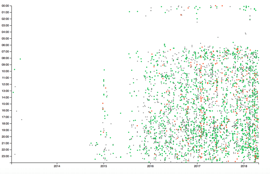
Now, let’s draw a chart that shows the date on the x-axis and the time on the y-axis. Let’s draw the user’s activities on the chart. Every point will be a post or comment. A big green point means an activity with a positive rating, a smaller gray point means an activity with zero-rating and a big red point is an activity with negative rating:

From this chart we can see some interesting patterns:
- The user wrote his first comments in 2014 but was not very active.
- For some reason, he started to post something at the end of 2014 and beginning of 2015.
- From the beginning of 2016, the user started to post and comment more.
- The red lines show us where the user had some hot discussions with others.
- We can see when the user is usually going to sleep and on which day he stayed late.
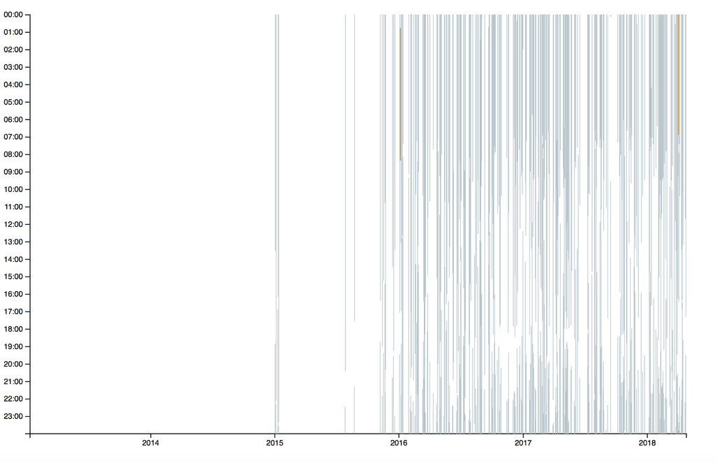
The thing about the sleep patterns and the user’s presence on the forum looks interesting. Let’s draw a chart, with the same axes, but draw a line if it is possible to detect the user’s absence on the forum during the day. Of course, we can do that only when the user posts something for several days in a row: say, the user posted on Monday, Tuesday, Wednesday, and Friday. We can guess when the user slept on Tuesday because there are activities on Monday and Wednesday. But if there is a comment, say, at 23:00 on Wednesday and then 7:00 on Friday, we can’t see if the user went to bed on Wednesday 23:30 or Thursday 11:45.
Anyway, let’s draw a chart. The grey lines are for inactivities that are longer than 8 hours, orange — more than 6 hours and less than 8, red — less than 6.
As we can see, there are only two times when the user didn’t sleep long enough:

Comparing two users
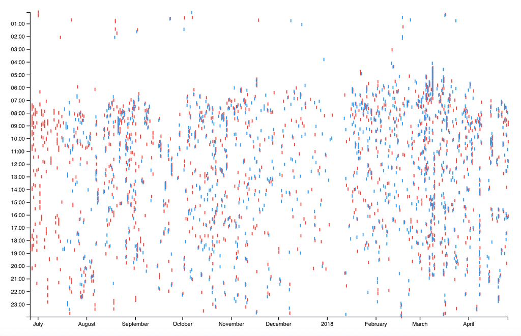
Some people create two or more accounts. We will not discuss the reasons for this but will try to visually compare to user activities and see if they belong to a single person. We draw the activities of two users on a single chart. Each activity is represented by a short vertical line, red for the first user and blue for the second. If a person posts from two accounts almost in the same time, this may look like . The lines will overlay each other and we will easily notice the common patterns in social activities of these two users:

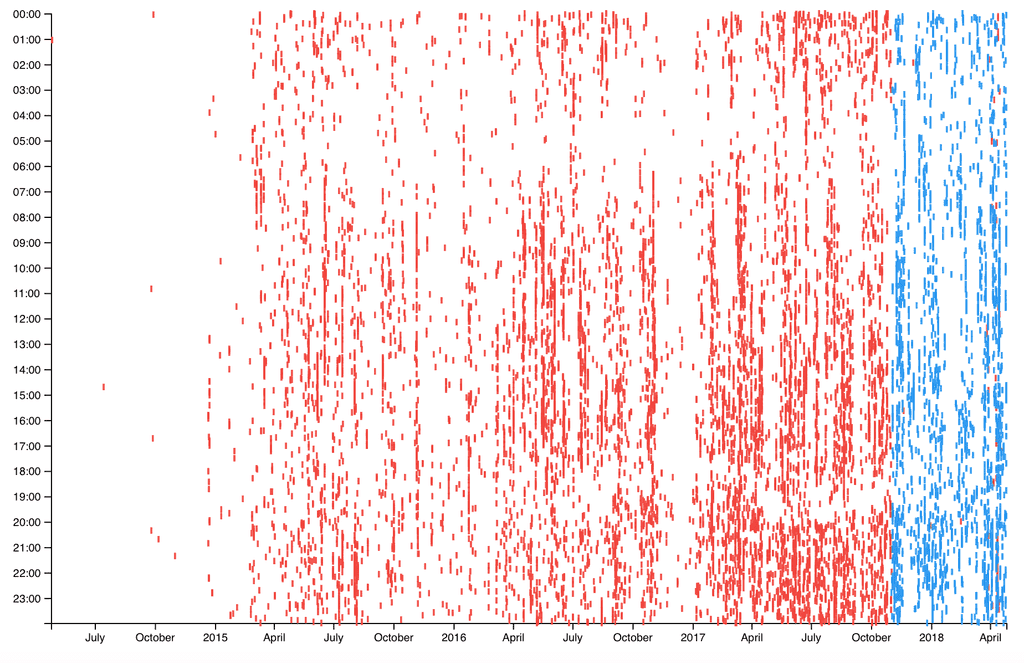
The common patterns are clear here. Here is another comparison, a person has created another user account but keeps posting from the first one from time to time:
